

The brand.
Logos, colors, type, and how to say the name. If you're putting Blowers Creative on something, this is how it goes.
Say it right.
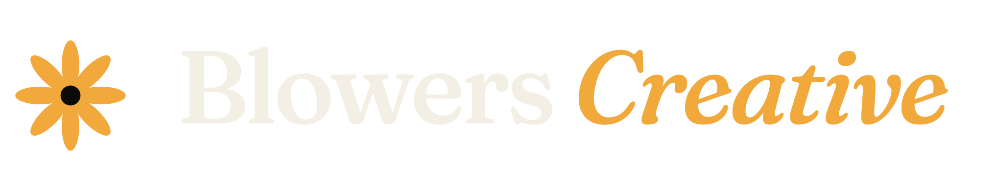
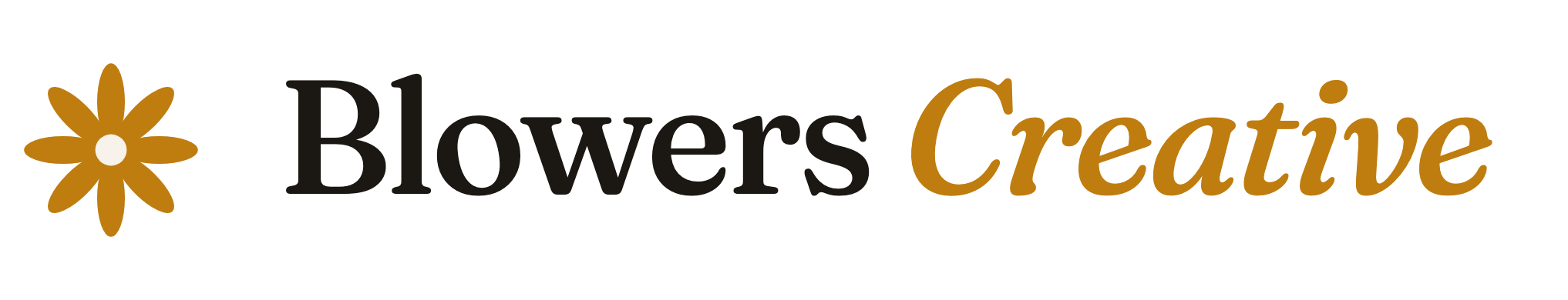
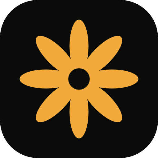
The logos.
The mark is an aperture. It is also a flower. Blowers, flowers — you see it. Don't stretch it, don't recolor it, give it some room.

The colors.
Four of them. That's the palette. Amber is the light — one per layout is plenty.
-
Ink
#0B0C0A
The darkroom. Near-black, slightly warm.
-
Bone
#F3EFE4
The paper. Type lives in this.
-
Amber
#F2A93C
The light. Use it like it costs money.
-
Moss
#6F8B58
The nature work. Supporting, not starring.
The type.
Three faces, all on Google Fonts. They don't need help.
Fraunces
Display. Headlines, and anything that should feel printed.
We take pictures.
Hanken Grotesk
Body. Light weights, plain talk.
A photography studio in Springfield, Missouri.
IBM Plex Mono
Labels, captions, frame numbers.
FR. 01A — THE SELECT
The voice.
Dry. Confident without being loud. Human. The humor sneaks in — it doesn't perform. No exclamation points.
Words we don't use
- Passionate
- Storytelling
- Innovative
- World-class
- Seamless
- Bespoke
Wrong
"We're passionate about capturing your vision!"
Right
"We take pictures. Good ones."
There's also a rabbit. It's the mascot. Don't ask.
Take it with you.
Everything above in one PDF — for printers, contractors, and anyone who asks "do you have brand guidelines?" Yes. This.