
How to spot AI-generated websites and marketing.
· 9 minute read
AI can make a decent first draft. The trouble starts when the first draft gets mistaken for finished work.
A website or flyer does not lose trust because a machine touched it. It loses trust when nobody can tell whether a person checked the facts, made the decisions, or looked closely before publishing. The output may be polished. Polished and considered are different things.
Look for a cluster, not one clue.
A purple gradient is not proof. Neither is a huge serif headline, a modular magazine grid, or a poster with enough fire to concern the county. Humans use trends too. A single odd finger can come from a bad crop. A single vague sentence can come from a Tuesday afternoon.
The useful question is whether several parts of the work share the same absence of judgment. Does the copy avoid specifics? Do the visuals disagree with themselves? Does the interface look finished but stop working the moment you use it? That pattern tells you more than any detector score.
The copy has volume, but no information.
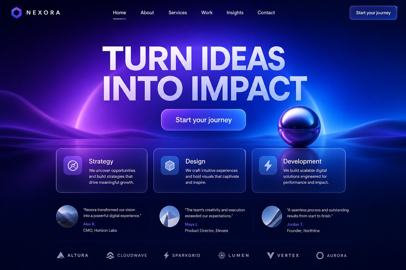
Generic AI copy makes large promises with very few nouns. It turns ideas into impact. It drives meaningful growth. It discovers opportunities. Replace the company name and the same paragraph still fits a dentist, a software company, and a place that rents inflatable slides.
Good brand copy contains facts only that business could say: who does the work, where it happens, what the customer receives, how long it takes, what it costs, and what the business refuses to do. Specifics give a reader something to believe.
The design arrives before the reason.
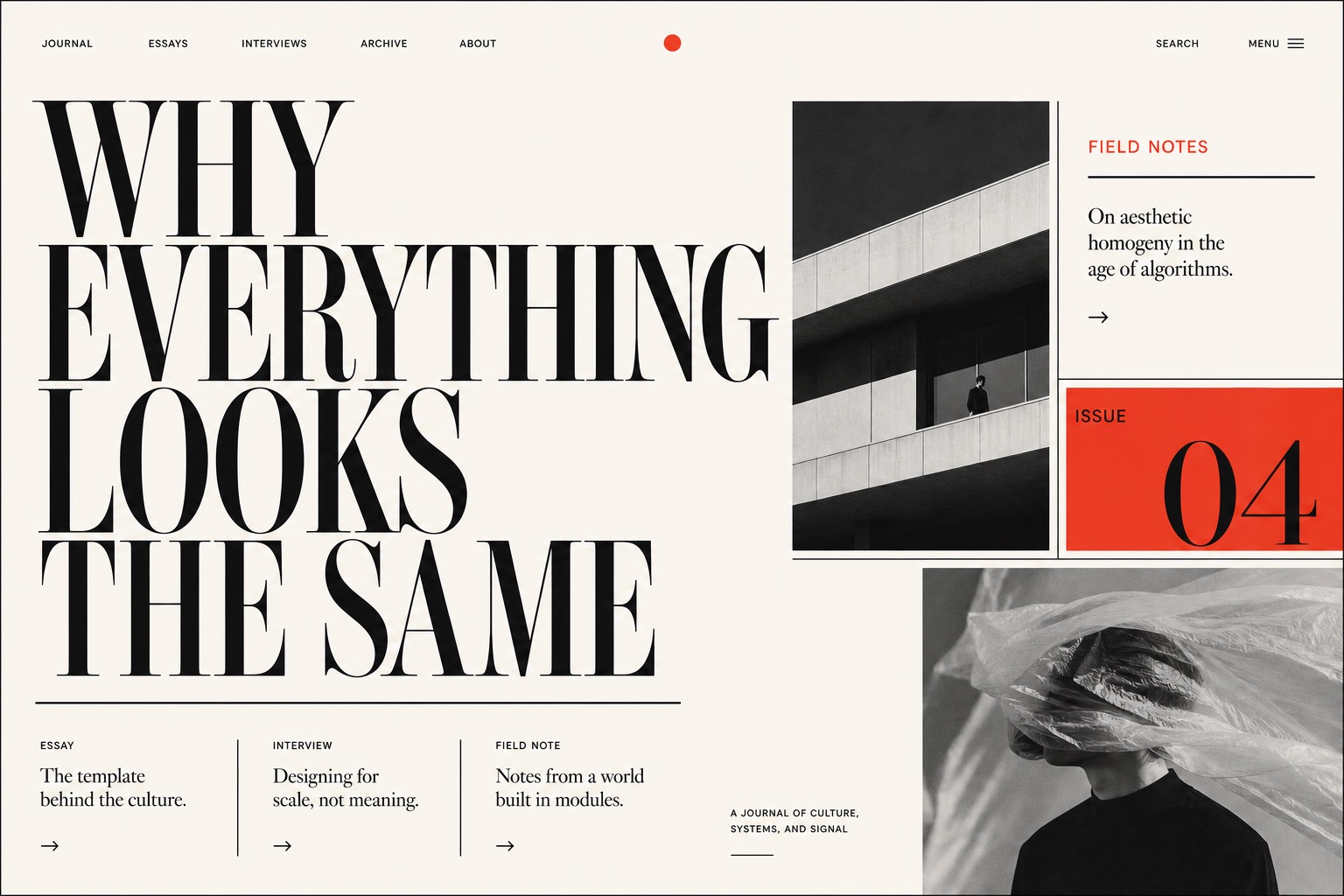
Editorial-style websites are having a very AI moment. The usual parts are enormous high-contrast serif type, warm paper colors, thin black rules, an asymmetrical grid, tiny navigation, and a severe black-and-white photograph cropped like a magazine cover. It can look excellent. It is also becoming the default answer to any prompt containing the words tasteful, cultural, or design-led.
A trend is a clue, not a conviction. The stronger tell is poor fit. If the site treats a plumbing company, a bakery, and an investment firm like three issues of the same art journal, the visual costume arrived before the business problem.
Everything is turned up to fourteen.
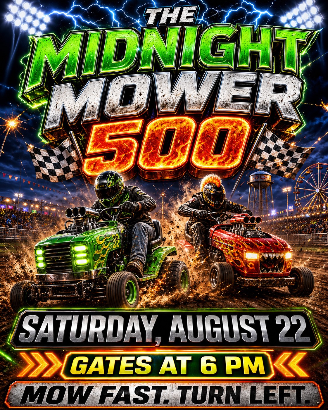
AI-generated flyers often confuse emphasis with quantity. Every word is large. Every edge glows. The background has fire, lightning, smoke, sparks, and a second kind of smoke. Once everything is shouting, the date and address have to shout harder.
The result can be funny. It can also make a real event look fake. The lawn mowers have superchargers. Nobody asked, including the lawn mowers. A trustworthy flyer establishes order: what it is, when it happens, where to go, and what to do next.
The details disagree.
Synthetic images often pass at thumbnail size and come apart at full size. Check hands, teeth, earrings, reflections, repeated objects, packaging edges, small lettering, and anything that should be symmetrical. One finger becomes another. A reflection contains a different label. A plant grows through a bottle. Tiny type begins as language and ends as weather.
This matters beyond aesthetics. Product imagery is a promise about the product. Event imagery is a promise about the event. When the picture cannot keep its own details straight, the audience has to wonder which other details went unchecked.

The website behaves like a picture of a website.
AI is good at producing the visible outline of an interface. The weak spots appear in use. Buttons lead nowhere. The mobile layout clips the headline. Keyboard focus vanishes. A form asks for too much and explains too little. Heading levels are chosen for size. The color contrast works in the mockup and fails in daylight.
A website is a system, not a screenshot. Trust grows when links go where they say, the page works on a phone, the copy answers the next question, and a person using assistive technology receives the same information as everyone else.
The voice changes when you turn the page.
The homepage sounds poetic. The about page sounds corporate. The FAQ reads like terms copied from a different company. Service descriptions repeat the same promise in three slightly rearranged sentences. This usually means each section was generated in isolation and nobody gave the whole site one final read.
A recognizable brand voice is consistent without repeating itself. It knows the names of the people, the place, the product, and the awkward details. Those details are often where trust lives.
Why unchecked AI costs trust.
Trust is the sense that somebody paid attention before asking for your money. A strange reflection or empty claim creates a small break in that sense. The reader then has to decide whether the mistake stops at the image, or whether the pricing, guarantees, testimonials, and contact details received the same level of care.
Generic work creates another problem: it makes the business replaceable. If the same headline, layout, and stock-shaped people could belong to any company, they do not give a customer much reason to choose this one.
What trustworthy work looks like.
- Specific claims supported by names, numbers, process, or examples.
- Real photography when the people, place, or product are part of the promise.
- A visual system chosen for the business, not for the trend report.
- Restraint. The important thing is allowed to be important.
- Human review for facts, tone, accessibility, and the odd little corners.
- Clear disclosure when synthetic imagery could change what a customer believes.
AI can stay in the process. It simply cannot be the final authority. Someone has to own the answer.
How we make it trustworthy again.
We audit what is already there.
We read the whole site, use it on real screens, check the claims, and find the places where the brand stops sounding or behaving like itself. Some fixes are a sentence. Some are structural. We tell you which is which.
We replace approximation with real material.
We photograph the people, product, work, and place. We write from interviews, actual process, prices, constraints, and useful proof. Reality has texture. Conveniently, it also has the correct number of fingers most days.
We rebuild the system around the customer.
That can mean a focused copy pass, a new set of campaign materials, or a website rebuild. The finished work should load quickly, read clearly, work with a keyboard, survive a small screen, and make the next step obvious.
We set rules for the AI that remains.
A useful workflow names where AI can help, where a person must review, what cannot be invented, and when generated material needs disclosure. That keeps the speed without handing the keys to autocomplete.